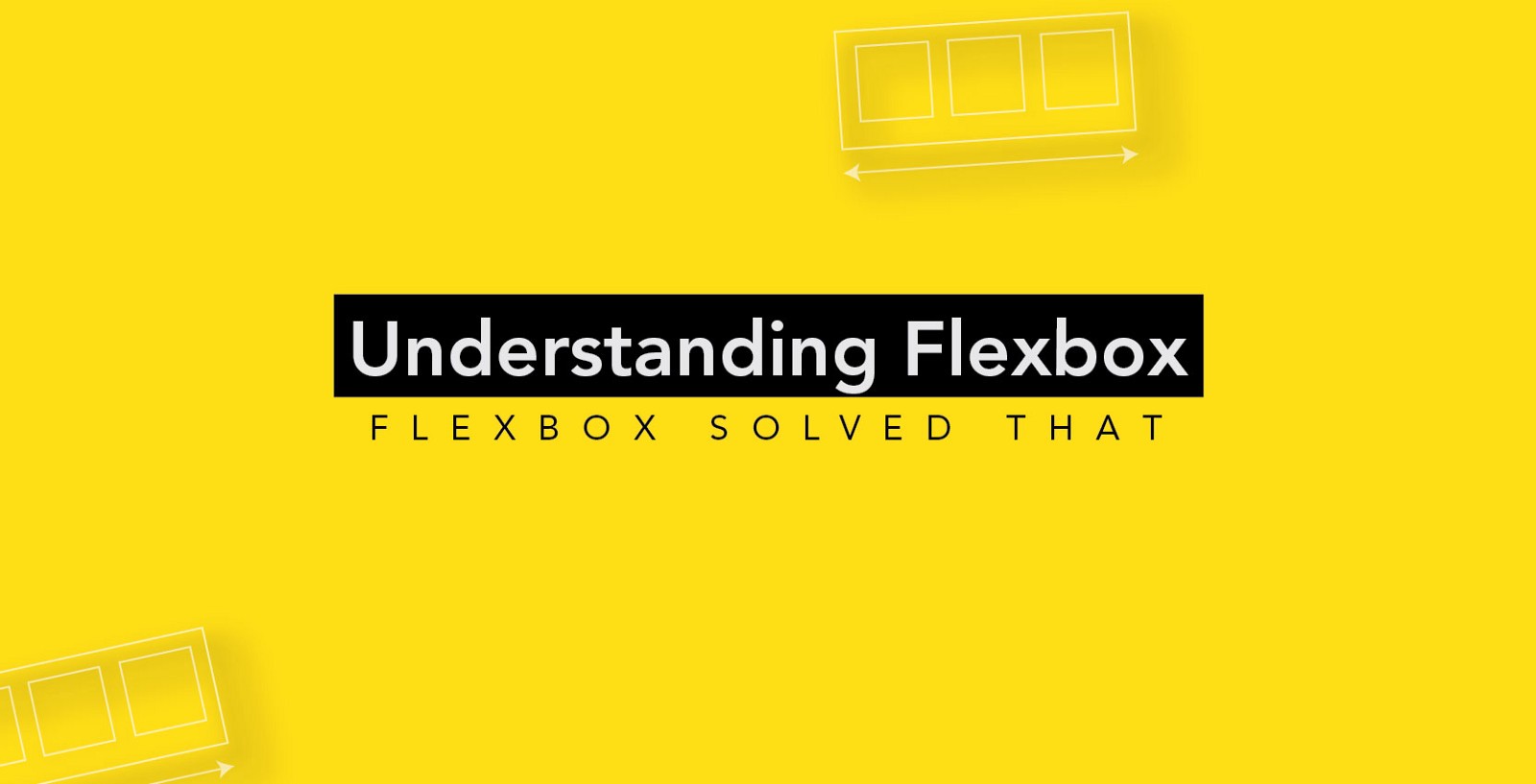
Flexbox, or the Flexible Box Layout, is a new layout mode in CSS3 designed for laying out complex applications and web pages.
In CSS 2.1, four layout modes were defined which determine the size and position of boxes based on their relationships with their sibling and ancestor boxes: the block layout designed for laying out documents, and that lays elements on a page vertically; the inline layout designed for laying out text horizontally inside block-level containers; the table layout designed for laying out two-dimensional data in a tabular format; and the positioned layout designed for very explicit positioning without much regard for other elements in the document.
Flexbox is similar to the block layout, except that it lacks many of the properties that can be used in a block layout, such as floats and columns. But then again it has more flexibility for distributing space and aligning content in ways that web applications and complex web pages often need. It solves many other layout problems that we have been fighting against and trying to solve for a very long time—such as vertical centering, for example, among many others.
Flexbox allows you to lay out elements in a container, arrange and (re)order them, align them, and distribute the space between (and/or around) them, regardless of their size. It allows you to make them literally flexible—items inside a container can be stretched and shrunk to accommodate the available space, and can be sized in proportionally to each other, and any available space between or around them can be distributed among them based on a proportion that you get to specify.
Using flexbox, you can also lay elements out inside a container in either directions: horizontal or vertical, called the flex directions; you’re not bound to just one direction as in other layout modes. This allows for the creation of more adaptive and responsive layouts that adapt to the layout changes on different screen sizes and orientations.
Summary of Flexbox Properties
- flex-direction
- flex-wrap
- flex-flow
- justify-content
- align-items
- align-content
- order
- align-self
- flex-grow
- flex-shrink
- flex-basis
- flex
Creating a Flexible Layout: The Flex Container and Items
The first step to start using Flexbox is to create a flex container. Children of a flex container are called the flex items, and are laid out inside the flex container using the Flexbox properties. Some of the Flexbox properties apply to the container, others are applied to the flex items.
A flex container is created by setting the display property of an element to either flex or inline-flex.
.flex-container {
    display: flex;
}
/* or */
.flex-container {
    display: inline-flex;
}
display: flex creates a block-level flex container; display: inline-flex creates an inline-level flex container. The flex container becomes a flex context for its direct descendants.
Children of a flex container, the flex items, are laid out using the Flexbox layout. Any element outside a flex container is not affected by the Flexbox layout defined on it, and will be rendered as it normally would in the page.
More Info


Superb! very interesting
Thank you 😛
color style studio paint color schemes 2.21.03
http://secsinafe.7m.pl/lugobe/the-sims-3-showtime-katy-perry-collectors-edition-pc-mac.html
princess isabella 2 return of the curse collector edition
http://izchielirep.7m.pl/qapoqawi/k-lite-codec-pack-9-95-full-update-834.html
librarian pro v1 4 7 incl keymaker core solidsnke
http://leraresre.7m.pl/tezagyh/battlefield-2-hacks-msxsecurity-v122-punkbuster-proof-8262017.html
http://snorepcepna.7m.pl/siposen/bitdefender-total-security-2017-17150682-x86x64trial-resetter.html
morpeh 3 protiv terrorizma vojna vo vietname 2017 pc iso
microsoft dynamics gp v2017 sp1 x86 dvtiso
Very Interesting and informative Blog…All the very best for your future accomplishments…
Thank you
Thanks for your support. :p
So nice & useful, very informative.
Thanks @Vishakh Raj
Yes Vishak Raj.. Really informative..
Thank you jisna.