Most styling tools ask you to commit to a worldview. Tailwind wants you composing utility chains in your markup. Bootstrap hands you a finished kit and a look you’ll spend months overriding. Both are excellent at what they do — but both make a decision for you about how your design system will work.
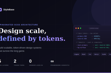
StyleBase takes a different posture. It’s an opinionated SCSS architecture for teams that value precision over speed: a clean, token-driven baseline you grow into rather than a destination you have to live with. Its own tagline puts it plainly — build scalable, token-driven systems that survive the long game. It deliberately stops short of being a finished design system, and that restraint is the whole point.
The numbers it leads with tell the story in shorthand: 5 CSS layers, 2 token tiers, 0 vendor lock-in, and framework-agnostic by design.
Three ways to build a design system. Only one survives at scale.
StyleBase frames itself against the two approaches most teams already know, and the comparison is worth borrowing whole:
- Pre-built UI kits are fast to start but hard to maintain — you’re locked into a vendor’s visual language and update cadence, and “low flexibility” plus “vendor lock-in” come along for the ride.
- Utility-first frameworks are great for speed, but they scatter logic into fragmented, verbose markup across large applications — logic bloat and markup noise that compounds as the codebase grows.
- Token-driven architecture — the StyleBase way — is a central source of truth for your entire design language. Change a token, update the product. It’s pure SCSS that works with any framework, gives you full control, and scales with the team.
That last column is the pitch. Not a UI kit, not a utility framework, not a Tailwind or Bootstrap replacement — a design architecture built to last.
Built on principles, not just syntax
Four ideas hold the architecture together, and each is a small argument against a common bad habit.
Atomic design tokens. Design decisions live in tokens arranged as a hierarchy: base tokens hold raw values, and semantic tokens map meaning onto them. Components only ever consume the semantic layer, so a button never knows what color it is — it knows what role it plays. The result the site highlights is striking: one token change updates every component using it.
CSS cascade layers. Instead of climbing the specificity ladder every time an override misbehaves, StyleBase harnesses native @layer to end specificity wars for good. Reset, base, plugins, components, and utilities are separated by design, so overrides are predictable by position rather than by force. !important survives only as a documented escape hatch for genuine edge cases.
REM-based sizing. Accessibility isn’t optional here — StyleBase enforces rem for spacing and sizing, with borders always written in px for visual precision. One deliberate wrinkle: media queries stay in px to avoid surprising layout shifts when users adjust their font size.
Theme-aware by default. Light and dark themes auto-switch via prefers-color-scheme, and a data-theme attribute always wins when you need to override. Because components read only semantic tokens, a full theme swap requires no component rewrites at all.
Structured for the long game
StyleBase ships a battle-tested directory structure that separates concerns and prevents the “CSS spaghetti” effect in large projects. Everything lives under src/scss, split into folders that each have one job:
tokens/— colors, font, spacing, and themesabstracts/— mixins, functions, and tools (no CSS output)components/— reusable building blocks like buttons, badges, and text fieldsutilities/— flex, grid, spacing, and display helpers
A single main.scss wires it all together by loading base resets, then tokens and themes, then components, then utilities — in that order. The separation means you always know where a decision belongs, and just as usefully, where it doesn’t. It ships ready to lint and format, too, with stylelint, prettier, husky, and lint-staged wired in so nothing untidy reaches the repo.
Layout without leaving the system
StyleBase includes dedicated flex and grid layout systems, both built on a 12-column structure. Flex handles one-dimensional, single-axis composition — the row-and-column alignment that makes up most everyday UI — while grid steps in when you need genuine two-dimensional control. Both share the same responsive vocabulary: mobile is the unsuffixed default, and variants scale up through tablet, laptop, desktop, and large-desktop. The advice is sensible: reach for flex first, escalate to grid only when the second dimension is genuinely required.
Up and running in three steps
The on-ramp is short — no CLI, no lock-in.
1. Copy the scaffold. Drop the src/scss/ directory into your project:
cp -r stylebase/src/scss ./src2. Configure your tokens. Edit the token files to match your brand — colors, type scale, spacing. One change propagates everywhere:
code src/scss/tokens/_colors.scss3. Import and build. Pull in the entrypoint and start writing semantic, scalable CSS:
@use 'scss/main' as *;See the architecture in action
The project includes a small set of starter primitives — buttons, inputs, badges, and toggles — built directly on the token system. They cover primary/secondary/tertiary buttons, status badges, theme and reduced-motion toggles, and form controls. You can fork them, extend them, or just use them as a reference for your own components. A reference Angular app demonstrates token-driven styling, the layered override strategy, SVG sprite icons, and accessibility considerations — but the framework choice is only for the demo. StyleBase itself drops into Angular, React, Vue, Next.js, Svelte, Nuxt, Remix, Astro, or any modern frontend stack.
Who it’s for
StyleBase isn’t trying to win the framework wars, and that’s exactly what makes it worth a look. If you’ve ever inherited a Bootstrap theme buried under override files, or watched a Tailwind codebase slowly turn its markup into an unreadable wall of classes, the appeal is immediate. This is a foundation for teams who want to own their design system while starting from a cascade strategy, a token model, and a layout system that are already thought through.
It’s free, open-source under the Zero-Clause BSD license, and framework-agnostic. In a landscape full of tools that want to be the answer, there’s real value in one that’s content to be the floor you build on — so you can build the system you’ll actually ship.
Check out StyleBase on github to explore the source, fork the starter primitives, or star the project.
GitHub


