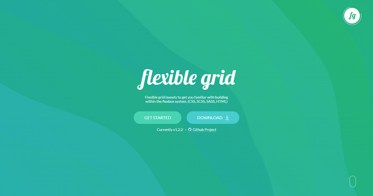
For users who can embrace the newest of technology, Flexiblegrid comes with an flex based grid. It’s the same grid you know and love, but with even better source ordering and alignment options.
Features
- Responsive
- Mobile First
- Semantic
- Readable
- RTL Feature
- Rails Friendly
Introduction
Get started with Flexible Grid. Quickly manage the layout, alignment, and sizing of grid columns, navigation, components, and more with a full suite of responsive flexgrid utilities. For more complex implementations, custom CSS may be necessary.
Website


