So we’re already into 2017, in case you haven’t noticed. That means you probably have already broken one of your New Year’s resolutions. Don’t worry, my resolution to get better sleep has already been dashed.
But one of my resolutions that I will not be breaking is to become a better graphic designer in 2017. And this is great news for you, because I will help you also become a better designer in the process.
If you have read any of my other articles, you’ll know that I am not a traditionally trained graphic designer. I am, instead, a writer who enjoys design enough to immerse myself in it and learn all that I can, using simple graphic design tool to help me along the way. And that quest continues into this new year.
A great place to start is to see what the graphic design world will look like this year, and what trends will take it by storm. And we think that 2017 will reject some of the past graphic design trends completely.
It is going to be an interesting year, to say the least. This guide will prepare you for those changes.
Graphic Design Trends You Should Know for 2017:
 Embed this infographic by copying and pasting the code below:
<img class="alignnone size-full wp-image-3047" src="https://venngage-wordpress.s3.amazonaws.com/uploads/2017/01/Design-Trends-2017.png" alt=“Graphic Design Trends 2017" width="1000" height="4100" /></a>
<p style="text-align: center; font-size: 14px; padding-top: 4px;">See this <a href="https://venngage.com/blog/graphic-design-trends">infographic on Venngage</a>.</p>
1. Louder and Brighter Colors
Over the past few years, many tech leaders used muted, safe and easy to digest colors. This was in an attempt to create a very clean and controlled design scheme. It was almost an attempt to show people that the sleek, functional future they have seen in science fiction movies was already here. But now that everyone and their mom have seen this design style work for Apple, the copycats have killed the power it once held.
Now, in 2017, there will be a shift away from neutral colors like whites, grays and black, to bolder and brighter colors. Some companies are already doing it and have been for a while, like the music wizards over at Spotify. In fact, they are already leading the pack, using bold colors mixed with professionally edited photos to create in-your-face designs.

This kind of color usage has become part of their brand, which means that their images are instantly recognizable. And when you are fighting for real estate on social feeds, powerful branding like this will help you win 2017.
Just because many companies will be ditching their boring color schemes in 2017 doesn’t mean there needs to be a color revolution in your company. Some companies will be adding just a bit of color, and it will make all the difference.
Using bold color accents will also help many brands cling to their minimalist roots. By infusing bright colors with traditional neutral backgrounds, companies can give their branding a fresh new look without straying too far from what made them great.
For example, we already saw this type of redesign from Instagram a few months ago.

This simple redesign helped bring them into a whole new era and unified all of the different apps under one color. And just like with Spotify, this type of bold color usage is recognizable across the web.
A large driving force behind the trend of bold and bright color usage in design comes from Google’s Material Design. Their design language focuses on flat, organized, and intuitive design. They use “unexpected and vibrant” colors, as well as fonts and images that are as functional as they are pleasing to the eye.

Actually, a lot of the things that will be trending in 2017 are influenced by the adoption of the Material Design principles.
We took their advice when designing this graphic to promote a new ebook. It has been an insanely popular featured image!
If you need some great examples of color palettes that fit this bold scheme, check out this article that helps you choose the best colors for your designs. Don’t be afraid to use colors that contrast starkly against one another.

2. Bold Typography
In 2017, bold typography will also fight against the ever-dwindling attention spans of readers, and the saturation of content. Big and daring fonts will be used to grab the eye.
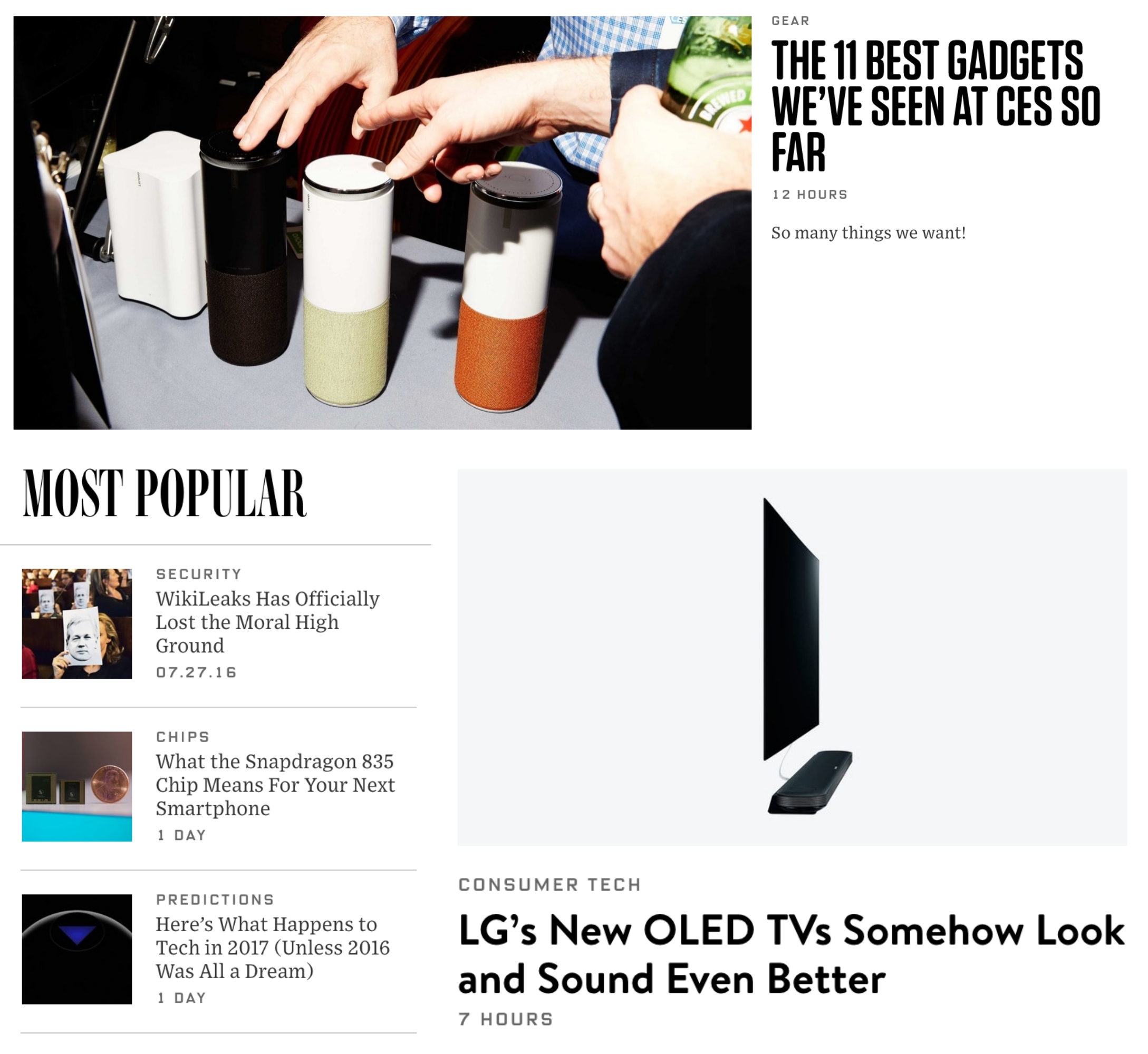
One of my favorite examples of this would have to be Wired. They use a mix of fonts to emphasize individual titles and establish a hierarchy of information on the page.
Just take a look at some of the examples from their homepage below:
A great example of using in-your-face fonts to grab the reader’s attention on social media comes from HubSpot. They make sure the text is front and center, with the graphic used as support:

HubSpot know that the time we allocate to digest a tweet is nearing zero each year. They combine concise, punchy copy with bold fonts to capture your attention.
Additionally, the shift to mobile and extremely high definition screens will also increase the need for bold fonts. Obviously, more and more people will be using their phones to get content, and the way that content is presented will need to keep up.
Want to take your infographic design to the next level? Download our interactive guide on The Dos and Don’ts of Infographic design!
Buffer uses strong headers in the body of their articles, not just at the beginning, to give them a backbone and make it easier to read across different devices. I would recommend using this approach to help people navigate long reads, no matter the screen size.

We also took a similar approach, when creating this infographic template. Mixing bold font choices with interesting colors to create an eye-catching graphic:

3. Google Fonts
I have been using Google Fonts for a while now because they are so versatile. If I need to design one thing online and then add it to my slide deck, I am confident the fonts will work together. And they play nice with about every blog or site you could build.
Website