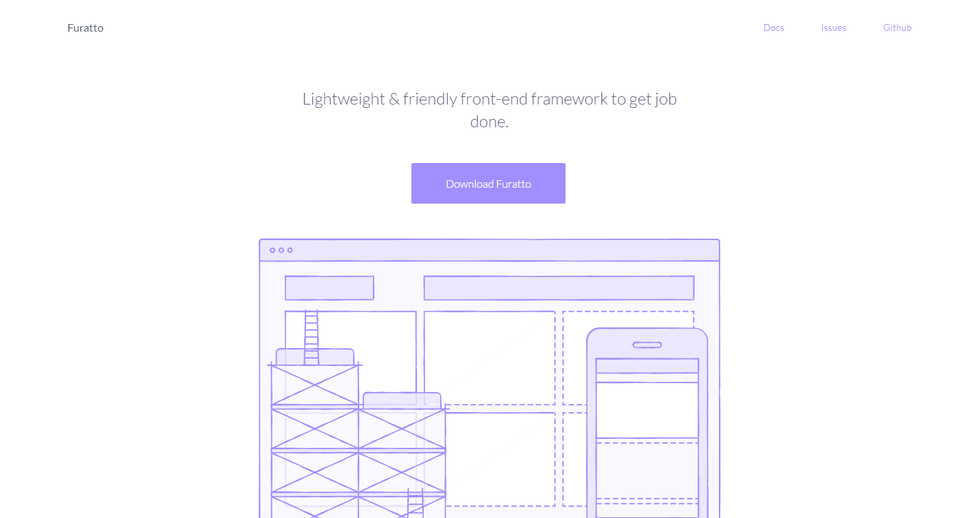
A CSS survival kit. Includes only the essentials to make camp.

Anish
Apr 21st, 2017
0
Angular Material – Material Design for Angular
Material Design is a specification for a unified system of visual, motion, and interaction design that adapts across different devices and different screen sizes. For developers using AngularJS, Angular Material is the reference implementation of Google's Material Design Specification. This project provides a set of reusable, well-tested, and accessible UI components based on Material Design.
Popular
-
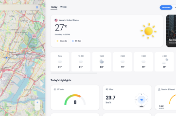
![Introducing My New Weather App: Real-Time Updates, Right in Your Browser!]()
Introducing My New Weather App: Real-Time Updates, Right…
Jun 20th, 2026 -
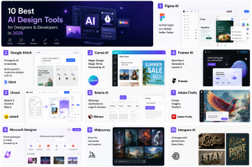
![10 Best AI Design Tools for Designers & Developers in 2026]()
10 Best AI Design Tools for Designers &…
Jun 15th, 2026 -
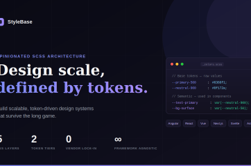
![StyleBase: Design Scale, Defined by Tokens]()
StyleBase: Design Scale, Defined by Tokens
Jun 4th, 2026 -
![The Classic: Breathing Life into the Web: A Beginner’s Guide to GSAP]()
The Classic: Breathing Life into the Web: A…
Jun 4th, 2026 -
![Cursor – The AI Code Editor]()
Cursor – The AI Code Editor
Apr 1st, 2025


